


CSS Grid Layouts are changing the way web designers are working, allowing for a more efficient way of laying out website content. It has been long awaited, but finally this approach has really taken off and in many cases, it is in production. It’s revolutionized the way websites are designed and once designers get the hang of it, it will give more flexibility to web layouts.
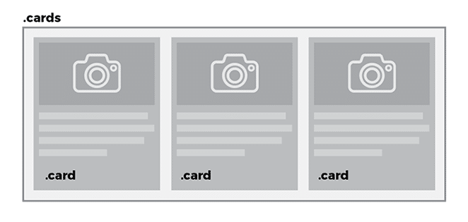
If you’ve tried designing with CSS Grid and have checked out tutorials on the web, you may have found information that pertains to an overall layout approach. Things like: header, content, footer, etc. However, CSS Grid can also be useful for other website details, such as cards. Card layouts are a common way of displaying content, and they can be efficiently created with CSS Grid. By using this method, card content areas are easily repeatable, can be viewed on many different device types, and the size is easily controlled.
CSS Grid Layout Tools
As you’re going along, you’ll want to inspect things on the page. Firefox has great developer tools for seeing grid areas. In version 52 of Firefox in the developer tools, you can see an overlay that outlines the grid. Firefox Developer Edition also has this ability.
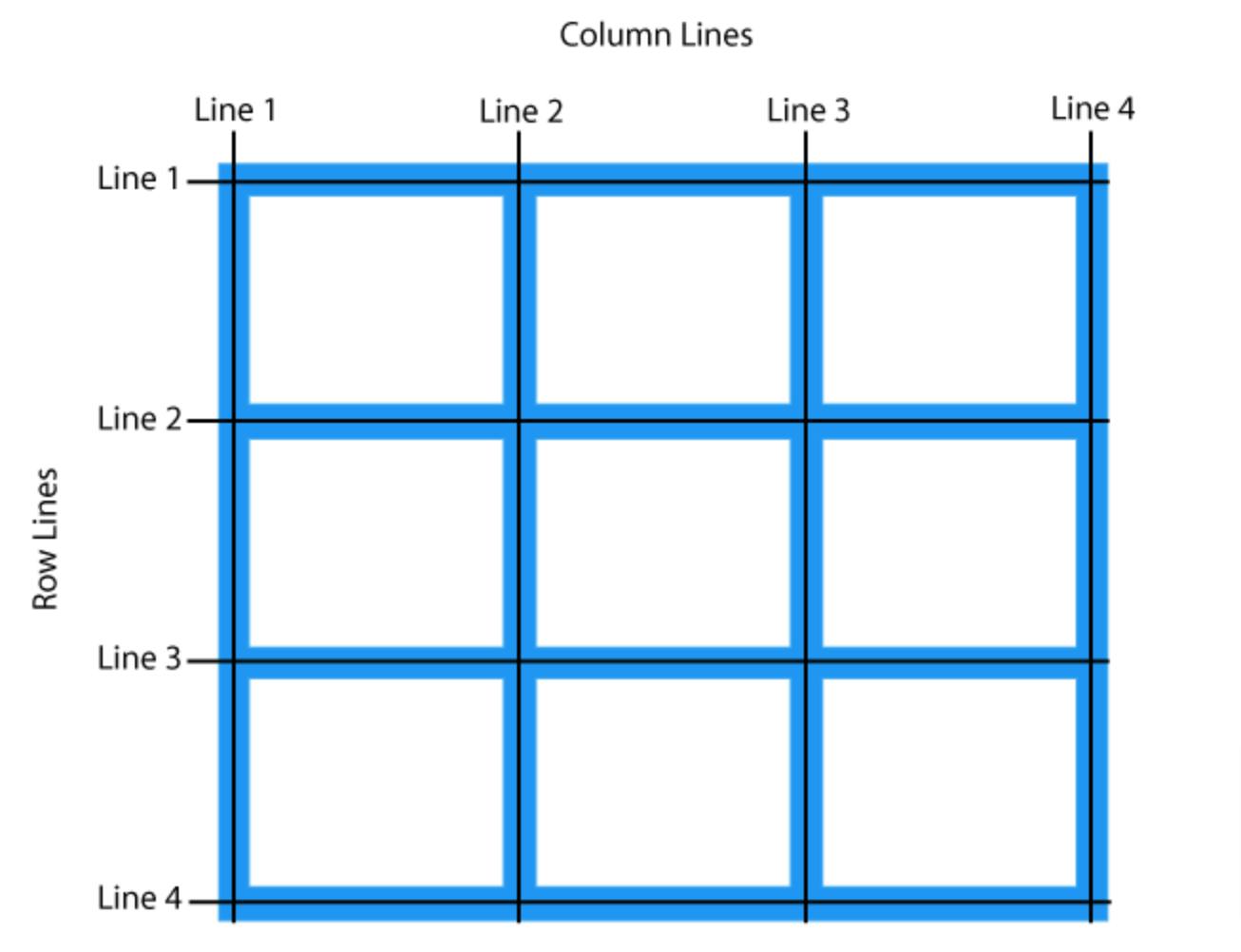
You select the Overlay Grid that you want to display (depending on your design, there can be more than one). The Grid Display Settings allow you to take a closer look by displaying the line number, area names, and how you want the lines to extend. This will be helpful as you design.
Simple cards with CSS Grid Layout
If you’re new to CSS Grid, you’ll want to brush up on the basics and create a simple CSS Grid Layout. Cards are great a great way to display content, as well as an interesting UI element that’s intuitive to use. They’re a great format for a user to quickly scan content and engage with what they’re most interested in. Cards also allow designers to format the content in a visually appealing way with great imagery, intro content, and links.
Cards and overall page layout
Just as an aside, it’s important to know that CSS Grid does not have to be used on an entire page layout. Grids can be used in certain areas of the page if needed. Since this is a tutorial on card layouts, a grid approach can be used exclusively here even if the rest of the page does not utilize CSS Grid. As long as the grid area is defined and display: grid; is declared on the wrapper, this approach can be used.
When you’re working with a set number of cards
In some cases, it’s easy to plan for a set number of cards. With a set amount of content, the number of cards will stay the same. For example, there may be four cards that explain business offerings, with each offering is on its own card.

For this example (and the others), all the .card items are inside a .cards container element. To accomplish this, it’s pretty simple.
.cards {
display: grid;
grid-template-columns: repeat(3, 1fr);
grid-auto-rows: auto;
grid-gap: 1rem;
}
 
.card {
border: 2px solid #e7e7e7;
border-radius: 4px;
padding: .5rem;
}
It’s important to display the value of.cards to grid.Without this, grid areas cannot be created. The next step is to define the grid-template-columns and choose the styling. The actual card styling will be declared with a class of .card.
Repeat for set number of cards
This is where the cards start taking shape. To create a fluid amount of columns per row, repeat is used with the repeat() function. This function takes two arguments: number of times to repeat and the value to repeat.

For example,grid-template-columns: repeat(3, 200px); computes to grid-template-columns: 200px 200px 200px;
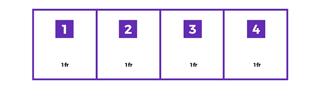
Fractional unit
You’ll see that the example code uses a “fr.” What is that exactly? This unit of measurement became popular with CSS Grid. Fr means “fractional unit” and 1fr takes up 1 part of the available space. It helps simplify space calculations.
Fractional units can be used alone or they allow you to specify a width of 1fr and you can add child elements, too. Multiple fr will be equally shared across all child elements
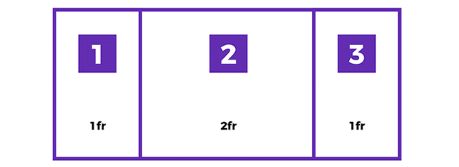
Different fractional units can be specified. For example, when grid columns are 1fr 2fr 1fr, two fractional units take up twice the space as one fractional unit.
Repeat for a dynamic number of cards
In some cases, you may not know the number of cards needed, so planning for a set number won’t work. The same approach will be taken as it was with repeat but there is the option to fit as many as needed with auto-fill.
grid-template-columns: repeat(auto-fill, 250px)
Width declarations are needed in addition to auto-fill. Keen in mind, with a px value, there may be space off to the right when there isn’t enough for the card to fit, but this doesn’t have to be the case, as you will see a bit later.

Columns will always fit the grid and the cards will be at least 200px. When the minimum space does not perfectly fit the space, this is where the max width comes into play. When another 200px width card won’t fit, the other cards will be larger than 200px, so they stretch to fill the row with more space and it’ll be distributed equally.
Mobile
Since the smallest and largest cards have been planned, this is a good time to talk about mobile. Cards work well on larger and smaller devices because content is in digestible chunks, and the cards can easily scale up and down. CSS Grid helps create a great mobile experience and in some cases, it’s much easier than having a separate media query.
In this example, cards need to size down to fit in mobile and size up to be a fraction of the space available, so they appear full-width on a smaller device, no separate media query needed:
grid-template-columns: repeat(auto-fill, minmax(300px, 1fr));
The minimum width of the card is 300px. As many 300px cards that can fit will appear in the row. When the device is very small, there’s a good chance that there isn’t the available space for two cards in a row. That’s when the1fr comes into play. The fractional unit is great for responsive designs. When two of the 300px cards won’t fit, this is where the mobile view becomes very apparent. When 1fr has been declared as the max width, a single card will take up all of the available space and they will stack on top of each other.
Grid gap
Now that the width of the cards is established, the decision to have space between them needs to be made. This property is available on grid containers and it makes it easy to create gutters in the design. Grid-column-gap creates the space between each card. When you see grid-gap, that refers to the shorthand for grid-row-gap and grid-column-gap. Grid-row-gap is the space on the top and bottom of the card, grid-column-gap is the space to the left and right of the card.